
The hourly trap
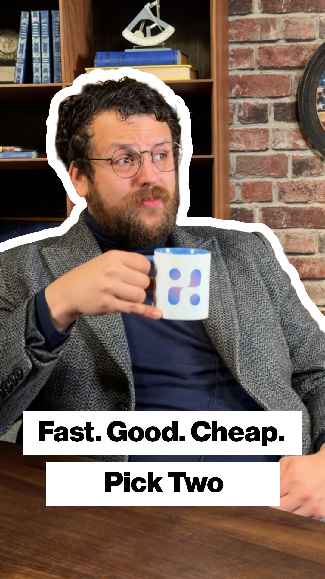
This is the cover for the episode on charging by the hour. The headline is three words, which makes it the shortest in the series, and it sits in a single box because splitting it would have made a short idea look like a long one.
Framelink Media scaled the type up to fill the width the shorter line left free. A thumbnail is read at a glance, so an unused half is wasted, and a headline that grows to meet the frame reads as deliberate rather than as leftover space. The box stays the same height as the ones in the rest of the run, so only the words changed size.
The frame catches him mid-explanation with one hand open, which suits an episode that is making an argument rather than giving a set of steps.
It belongs to the same vertical run as the rest, and keeps the white outline, the plant and wall setting and the black on white type that hold the series together.